Kleiner Perkins design challenge: Redesigning Netlify
PUBLISHED JAN 17 2023
In this case study, we take a look at how Netlify can modify their user interface and user flow to simplify key actions. Netlify is one of the most popular options when it comes to deploying websites from code respositories. Their use cases span from individuals to large companies, and an effective redesign would mean a more seamless experience for countless users.
User interviews
I interviewed developers with a range of experience, both specifically in Netlify and broadly in web development. Some were well-acquainted with Netlify’s interface, while others had only tried to deploy a site once or twice. Based on these user interviews, I found that the most prominent pain points lay in clearly navigating through the site and understanding where they were among the potential pages. Many of the pages presented too much information without clear hierarchy, and provided too much action autonomy.
Design approach
The name of the game is differentiation. I mapped out the typical user journey below: developers start by clicking to view a certain production or preview deploy, or clicking to view all deploys of a certain type. From the “production” or “preview” deploys page, the user then clicks on a specific deploy to view more details and visit the site.
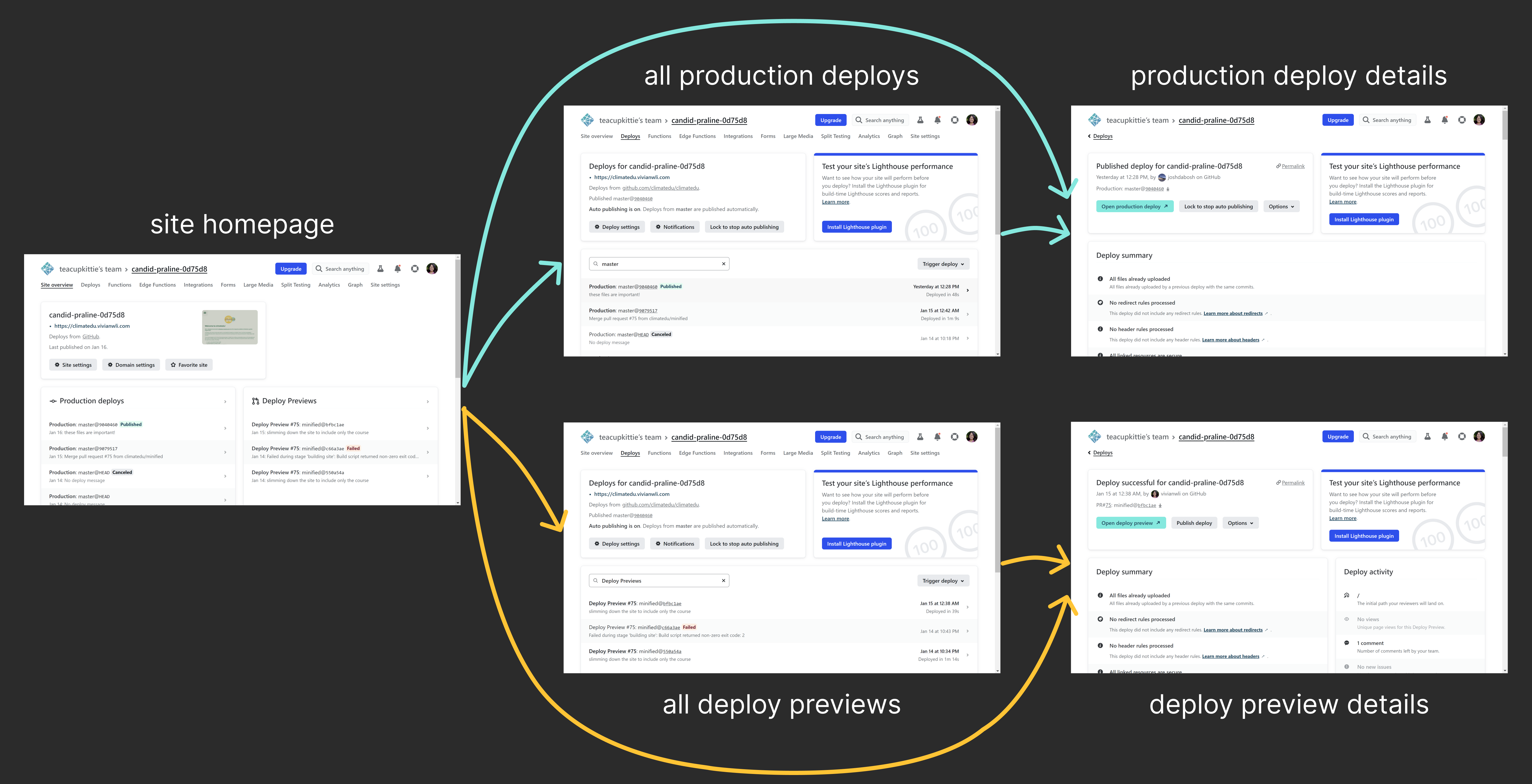
It took me a while to even realize that the two different actions (clicking to “view production deploys” and clicking to “view deploy previews”) actually led to the same page. The screens looked so similar that they were often mistaken for each other, and yet they misleadingly appreared to be distinct pages despite just being loaded in different states. As echoed by the user interviews, users often felt like they were running circles in a maze. I decided to reorganize page navigation points to be where they were most intuitive.
Moreover, we want to keep the interface simple to navigate for novice and experienced users alike. Since nearly all Netlify users share the same goals and key actions, we want to give the user as few options and steps as possible. In this case, the fewer pages, the better—especially since several of the pages in the user flow shared significant overlapping information. Therefore, I propose this user flow refactor that slims the journey into just two screens.
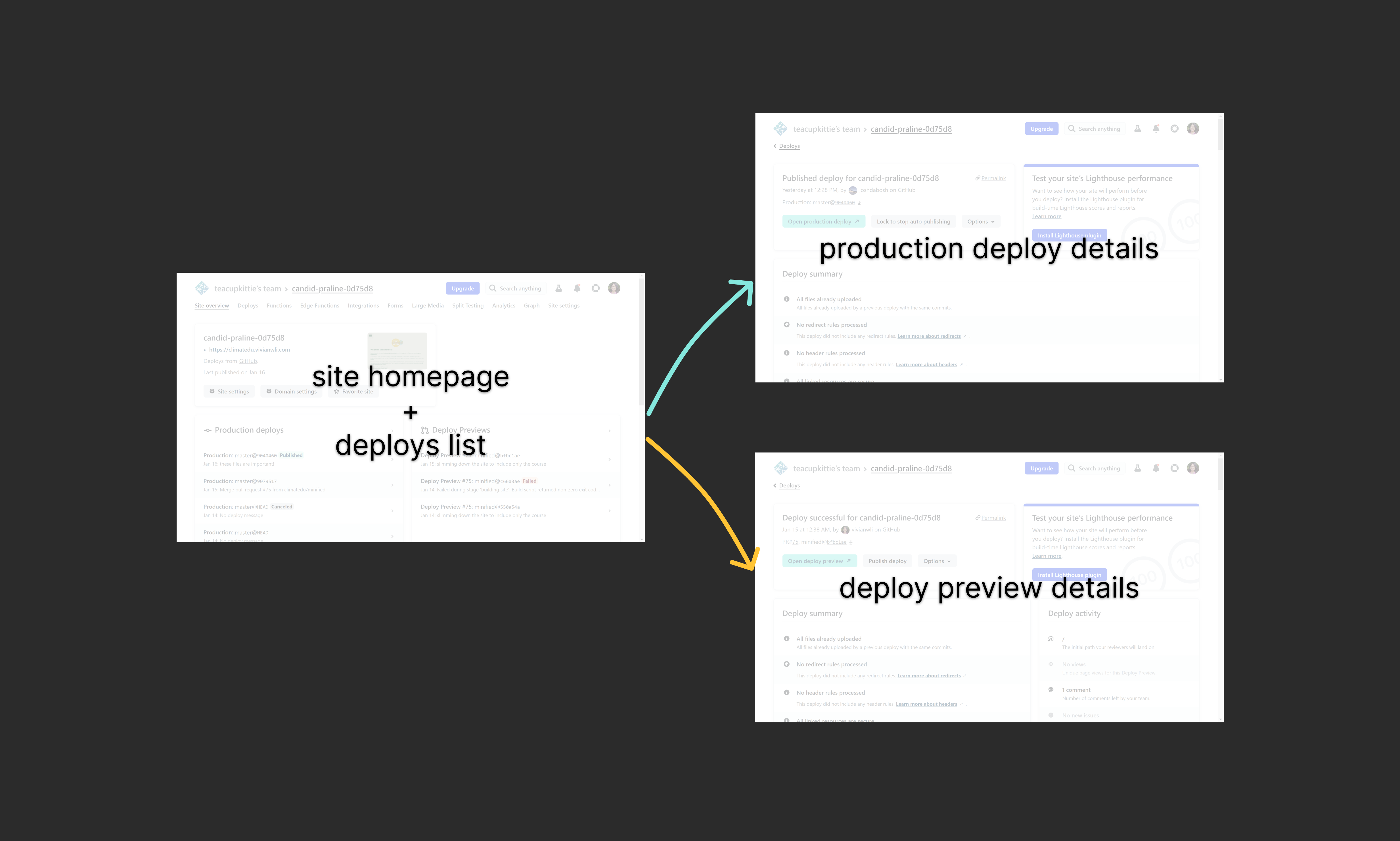
Here’s what the reimagined user flow looks like in action. Below are the original screens:
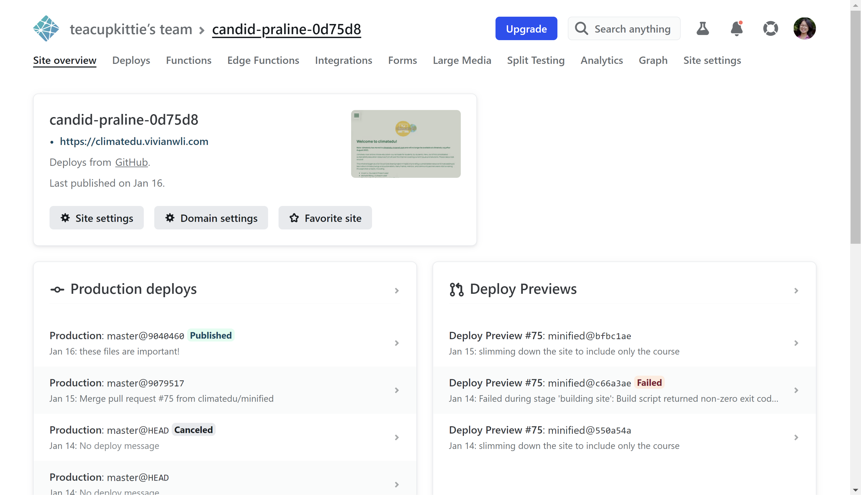
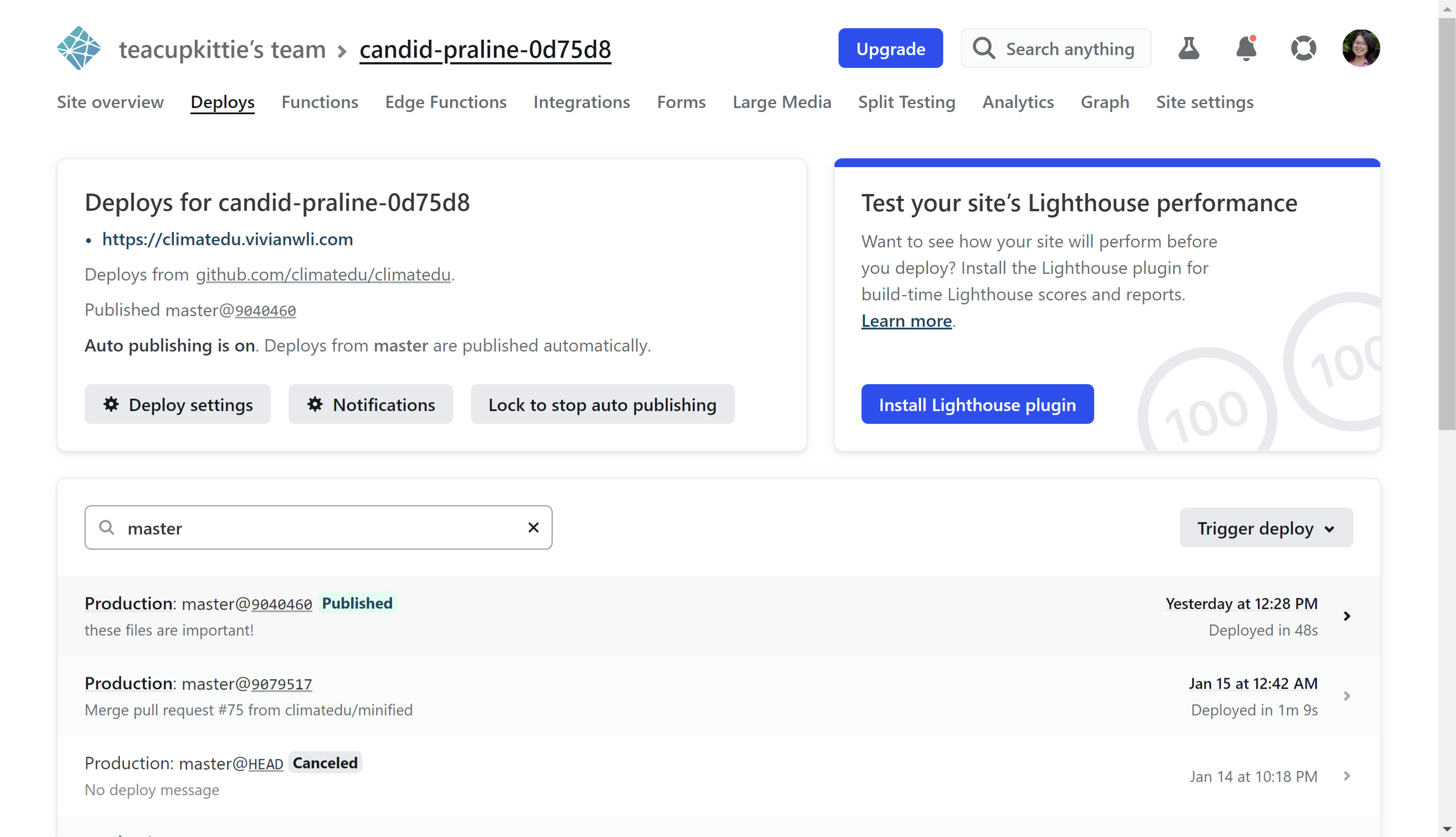

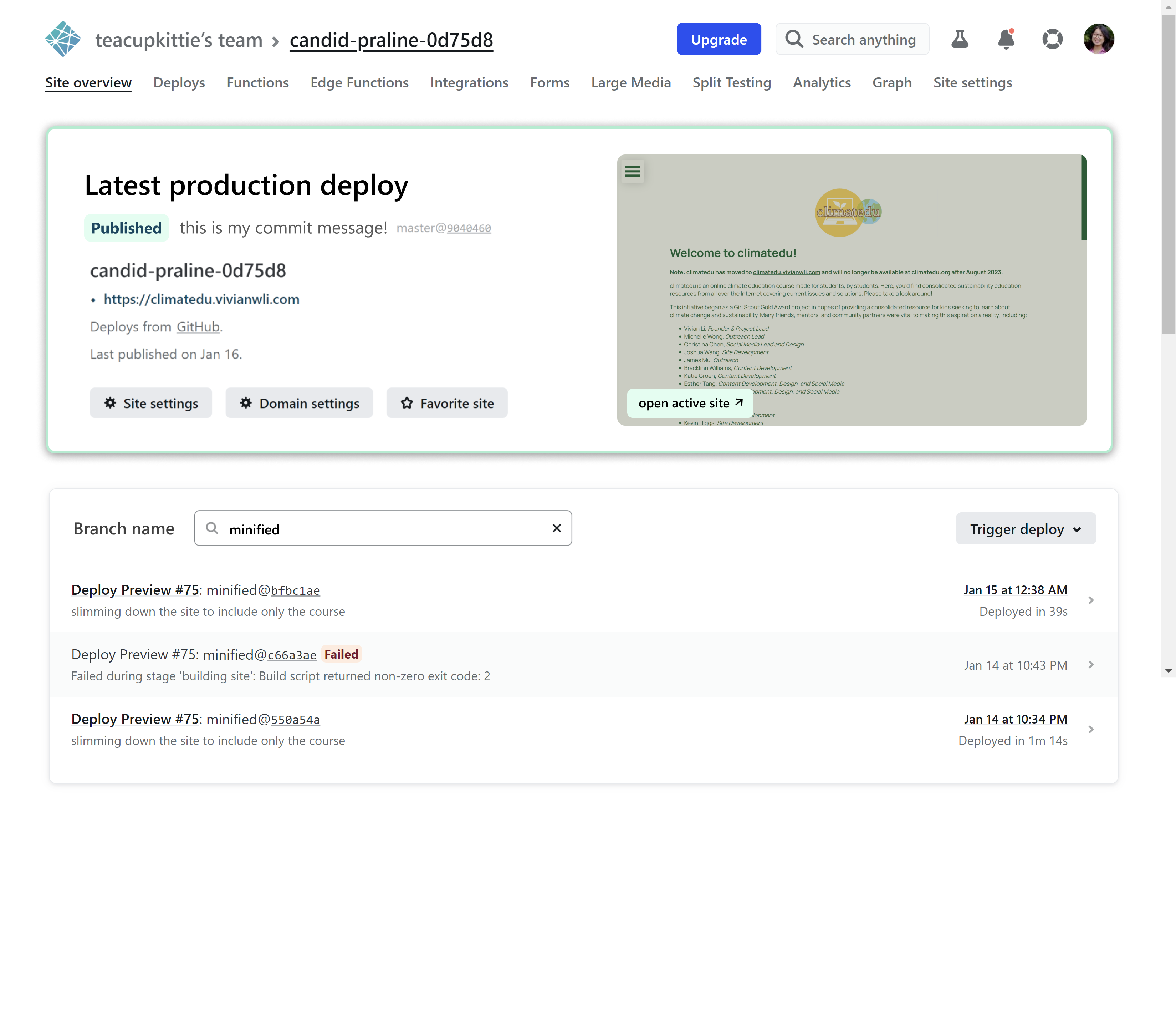
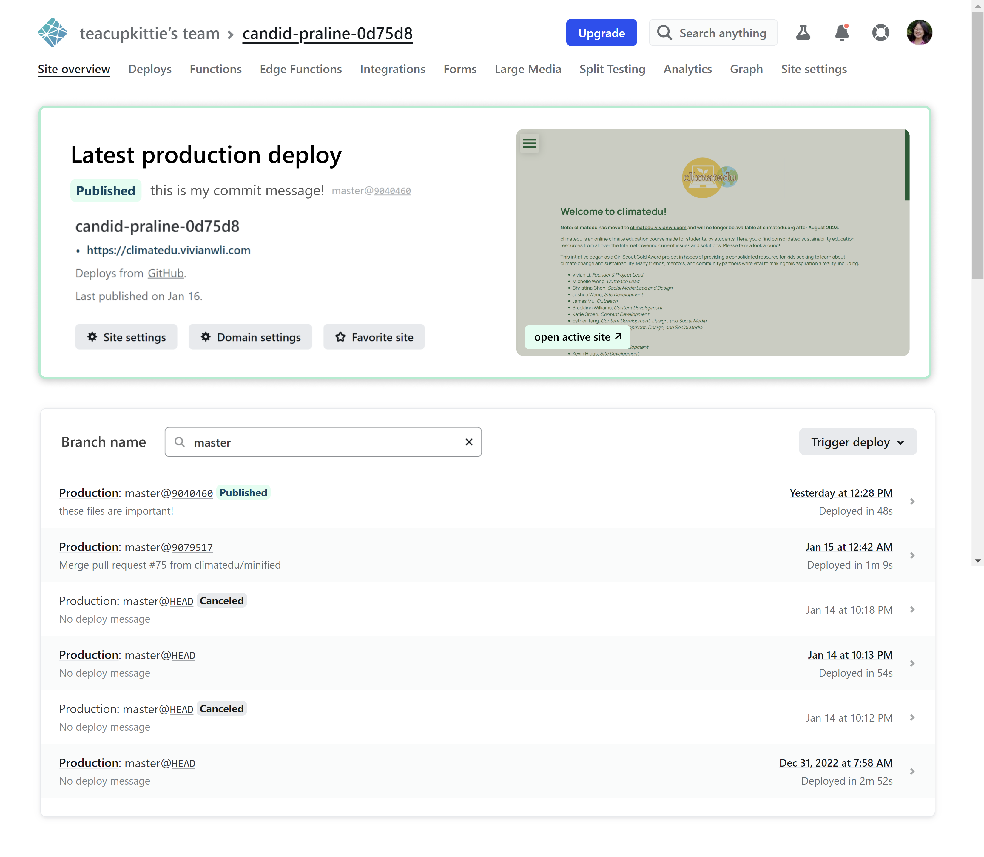
I wanted to make the most of the space on the site homepage, utilizing the empty space in the top right corner to instead enlarge the site thumbnail and draw attention to the most recent published deployment. As a pseudo-”hero” for the page, a pictorial preview is a great indicator for which site the user is viewing, as well as what state the most recent site is in.
This new enlarged component on the homepage features several additional adjustments: a large “Latest production deploy” label, a green border to signal “active” status, and a descriptive commit message that is prioritized above the commit branch and hash. It includes the same functionality from the original smaller component, but adds a “open active site” button to calls users to see what’s live without navigating through the user flow.
We combine two pages into one page, in turn simplifying three steps in the user flow to just one all-access dashboard where users can toggle between production and preview deploys. By keeping this component on the homepage, we remove the illusion that the production and preview deploys are on different pages. We consolidate the displayed information in a form that feels more lightweight and gives the user more control.
Finally, I also added a much-needed “Branch name” label to the deploys component, calling on users to specify a certain branch from which to view deploys where it was previously unclear.
That’s it! Simple changes that still keep the user’s familiarity, but improve the user’s ability to navigate and take the most common actions with ease.