
The New York Times
Interactive data visualizations for the 2022 and 2024 U.S. elections results and internal reporting software improvements.
In 2022, I worked on the Interactive News Team (INT), primarily on elections — building interactive data visualizations for U.S. election results pages, improving internal reporting tools, and contributing to data journalism projects. The elections rig spanned TypeScript, Next.js, Svelte, and a PostgreSQL backend. For more about the internship experience, you can find my blog post here.
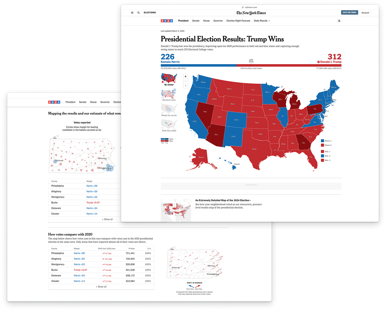
In 2024, I returned to help out with data visualizations for the U.S. presidential elections, this time for the Graphics Desk. I worked on a number of editorial articles, as well as the key counties visualization for each state.
2024 projects
Check out my work on the Graphics Desk from 2024 live at my byline page.
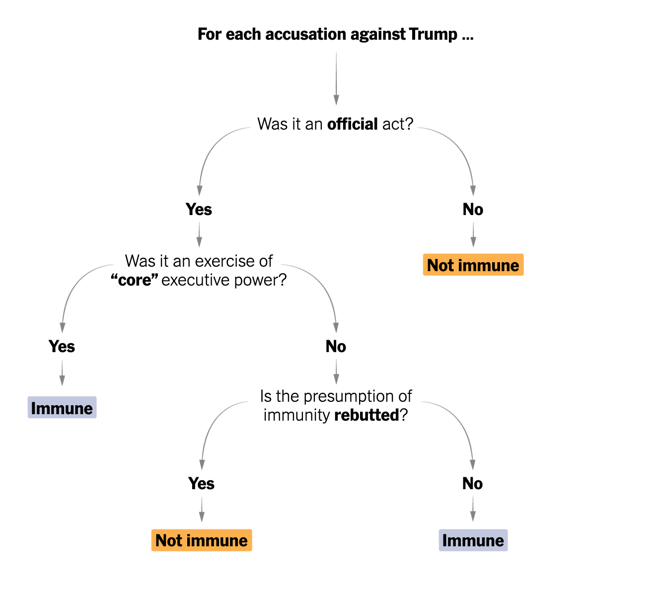
How a judge will weigh immunity in Trump’s Jan. 6 case.
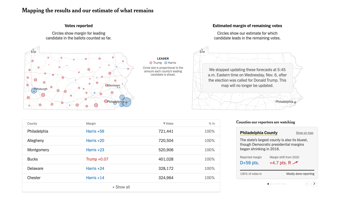
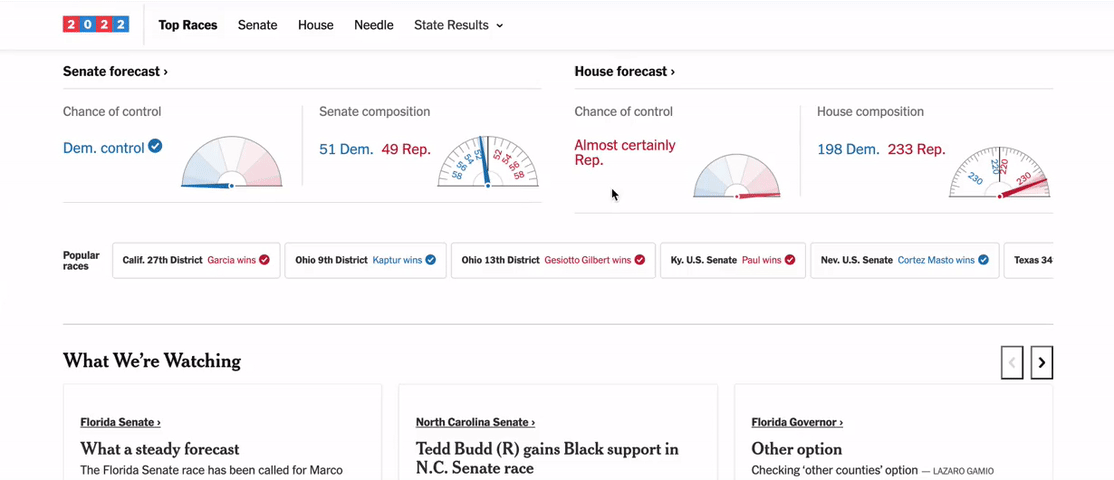
Key counties visualization for 2024 election results.
2022: Elections asset layout editor
This was one of my biggest projects of the summer. Our elections reporting rig is composed of several apps which gather data, manage election events, publish pages, and more. The election-pages app previews and renders all New York Times election results pages. I worked on an interactive wysiwyg-style editor for elections asset layouts.
Imagine it’s a hectic election night and the Alabama Governor’s race gets really interesting. We’d want to move the AL Gov. race to the top of the page — but to change page layout, we’d currently have to go into the code, edit a complicated JSON, and re-deploy. This interface allows users to rearrange sections and edit properties without ever touching the code, lowering the barrier for non-engineers on election night.
A preview of the asset layout editor's functionalities.
I designed this interface in Figma and developed it from scratch, spending significant time on aesthetics and microinteractions. I also connected my interface to the rest of the app, pulling in existing page layouts and creating APIs to send the layouts back to the election-admin app.
2022: UI/UX improvements in the election-admin app
One of my first projects on INT was a UI/UX audit of the election-admin app, which is responsible for managing events and assets — whether standalone pages or embedded components. A more user-friendly interface would make it easier for different people to configure elections without significant training, letting us run election nights more reliably and with fewer people.
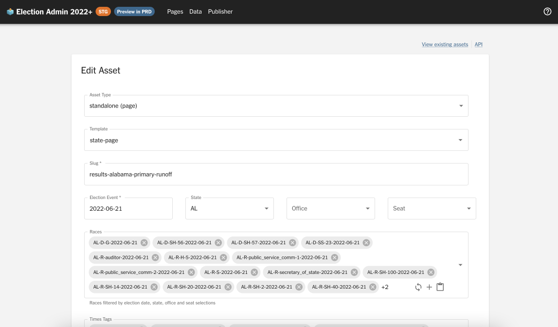
Before: asset details and election event details.
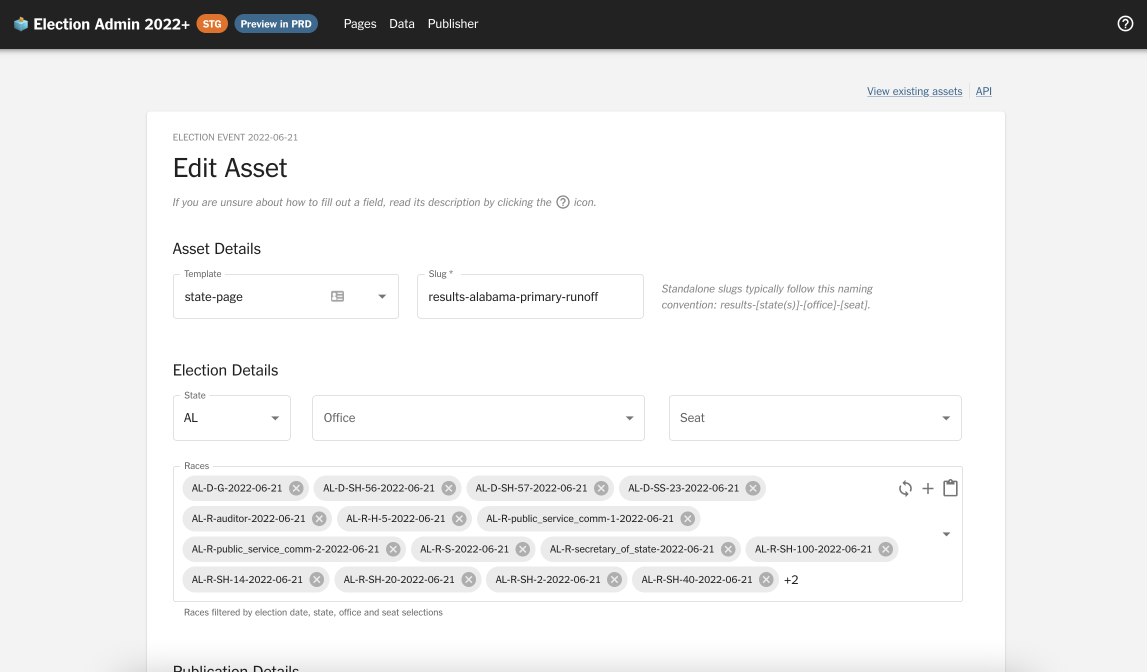
After: asset details and election event details.
- I introduced section headers (Asset Details, Event Details, Publication Details, Advanced Options) to make the interface more self-explanatory
- I adjusted field widths to match their intuitive sizes (e.g. a state code like “CA” will never be full-screen wide)
- I hid inferrable fields like
Asset typeandElection event - I rearranged the order and layout of form fields to reflect the user’s priorities, rather than the developer’s
- I added captions and documentation to guide users through the form
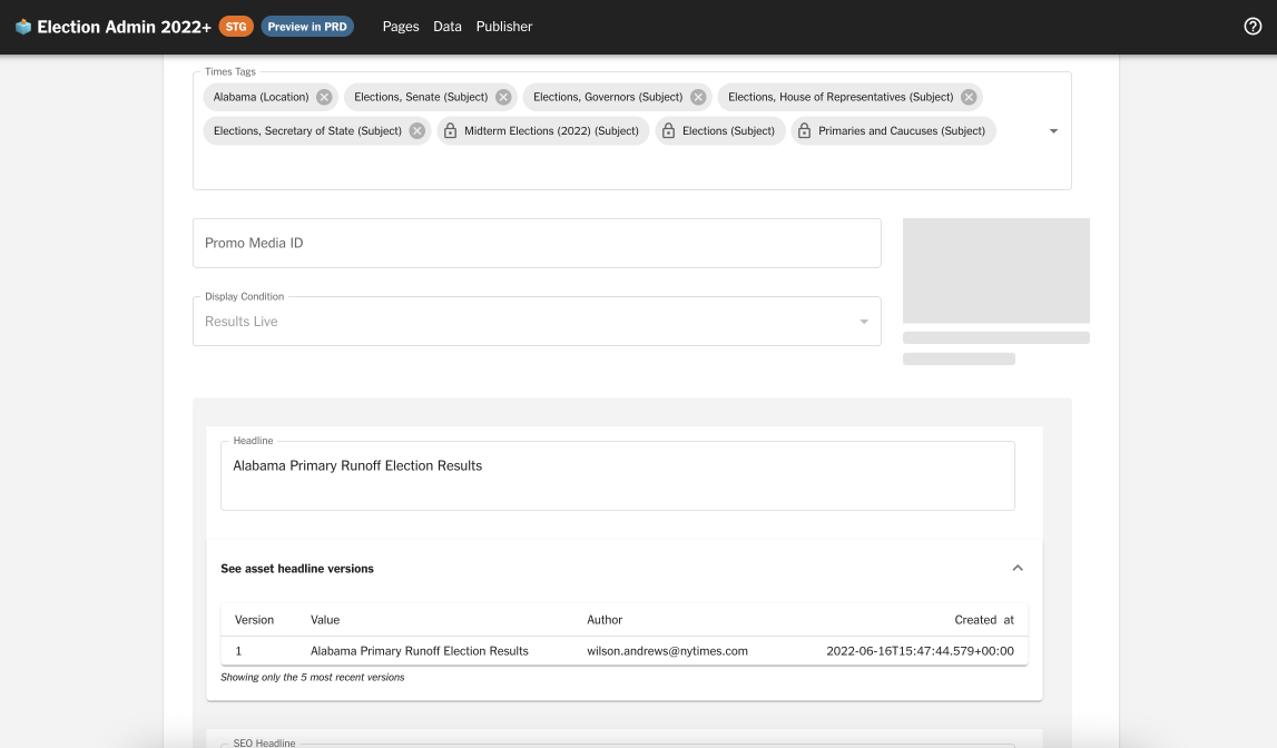
Before: publication details and version history.
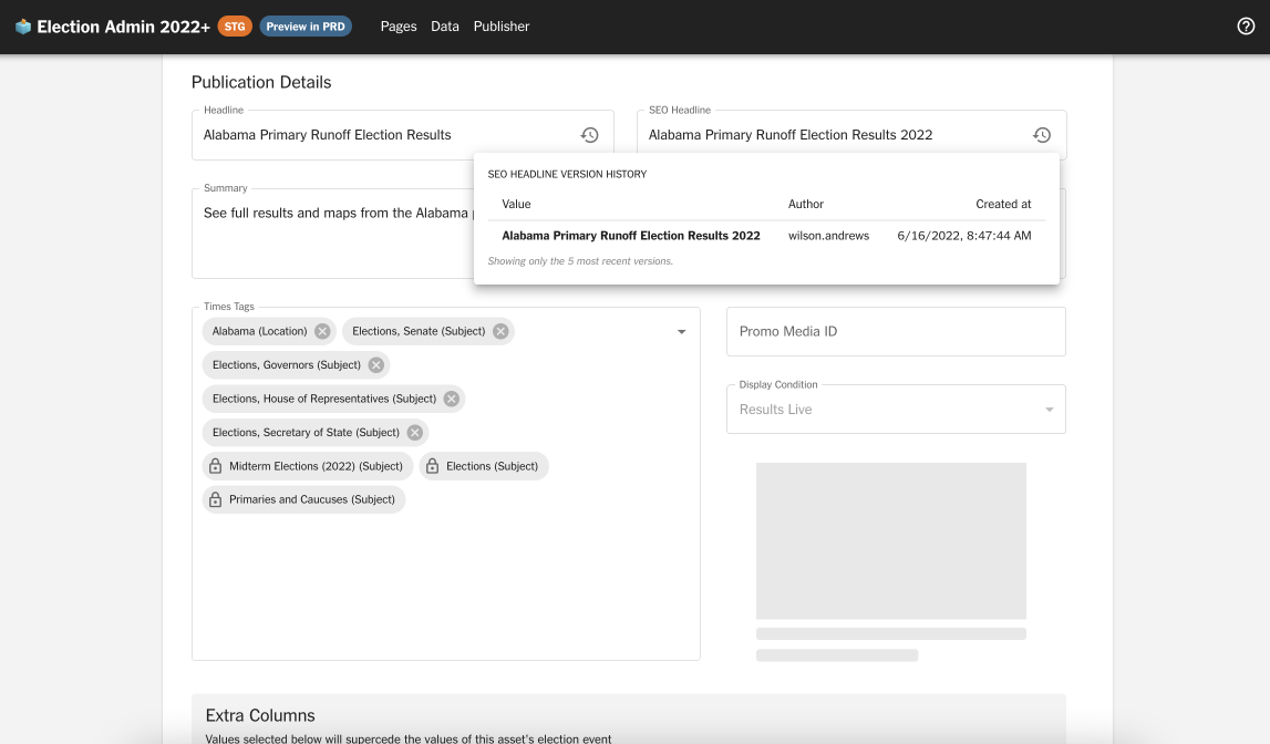
After: publication details and version history.
- I slimmed down the version history display: rather than a full-width accordion, I created a popover with more readable formatting
- I untangled arbitrarily grouped version history fields and rearranged them to make intuitive sense
- I optimized text field widths and created a larger space for the image preview
Before: publication details and advanced options.
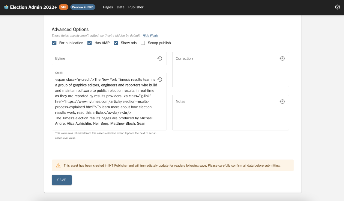
After: publication details and advanced options.
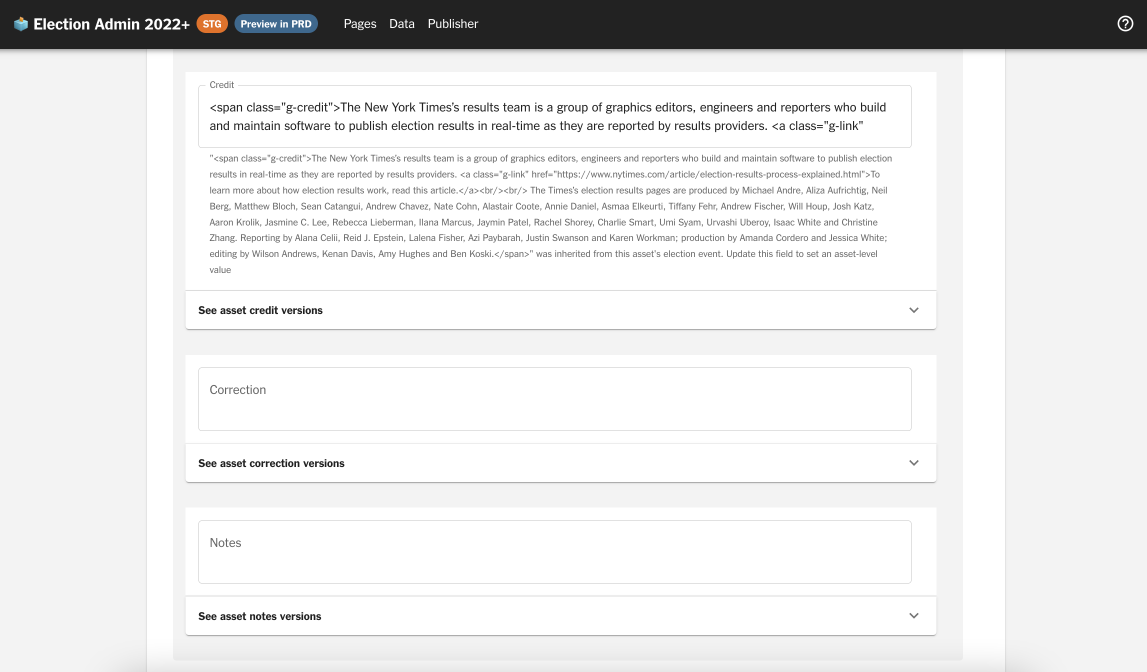
- I moved rarely-edited fields (Byline, Correction, Credit, Notes) into a collapsible “Advanced Options” section so as not to overwhelm users
As an interface touched frequently by many people, this audit and refactor had a lasting impact. Several months later, it’s evolved to become even better.
2022: Trending races component
A project that is live! This trending races component was developed for the front page of NYT’s election results. I owned the feature end-to-end — design, development, animation, algorithm, and testing.
A GIF showcasing the Trending Races animation interaction.
I’d followed the project from its inception, back when we weren’t sure what to do with Chartbeat API data we were collecting. Once we settled on the idea, I became the primary designer and developer for the feature.
I pushed for design changes that clarified our vote percentage bar, where the reader might otherwise find it ambiguous. Adding a numeric label significantly improved a reader’s ability to understand a race’s status at a glance. After interviewing several team members and friends for a layman’s perspective, I chose a variation that incorporated a descriptive label while still matching brand guidelines.
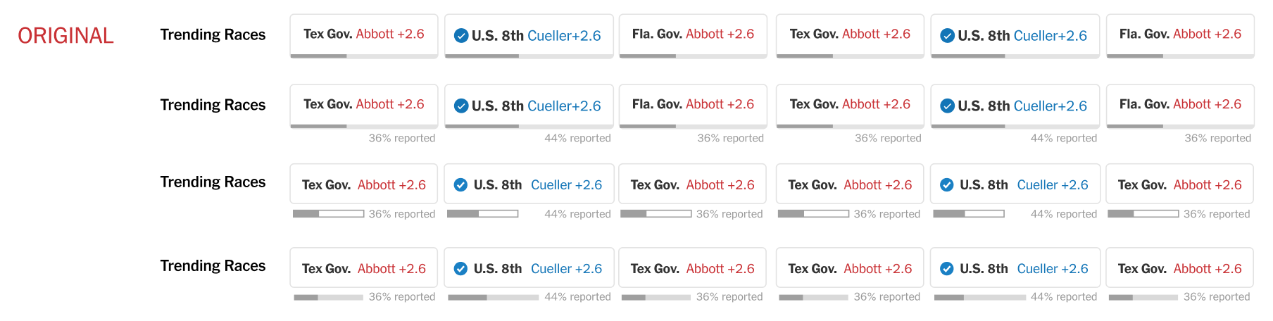
Potential Trending Race component designs from Figma. We chose a modified version of #2!
GitHub code reviews doubled as user interviews. I quickly realized the importance of mapping every possible component state — mid-vote count, called, no results, runoff, and more — and optimizing the design for each. I continuously iterated based on team feedback.
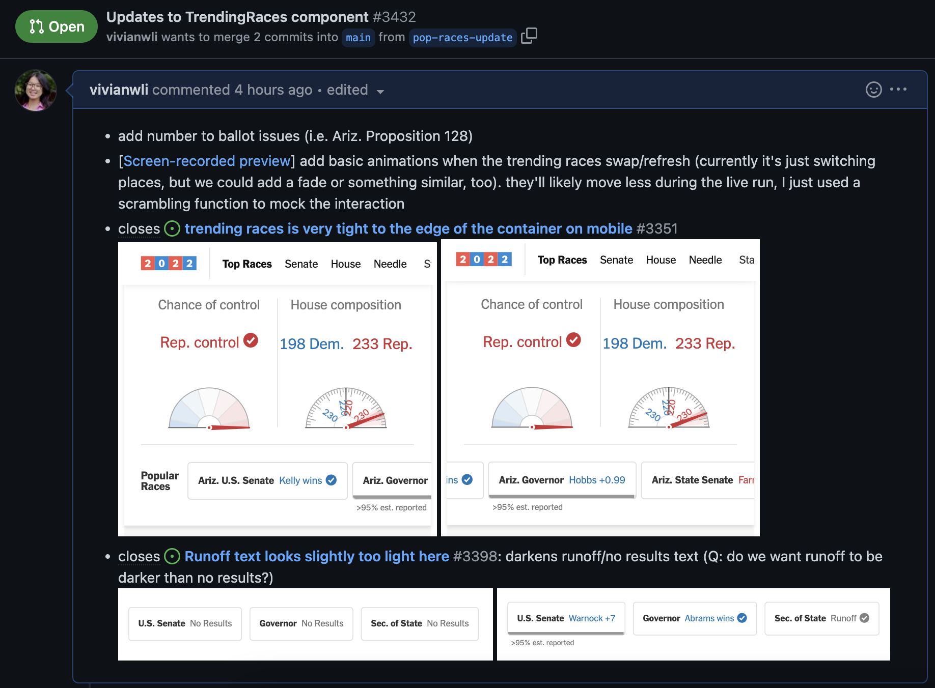
A PR implementing design feedback and including No Results and Runoff designs.
Alongside the Times audience team, I contributed to the trending algorithm that used total page views and top change in views to surface what captured readers’ attention in real time.
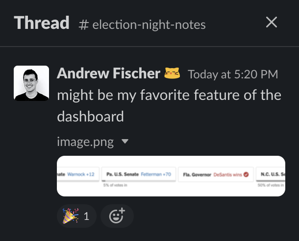
High praise from the 🐐 in #election-night-notes.
2022: Self-driving car crash data
A spontaneous, opportunistic project! When the NHTSA released a data dump of self-driving car crash reports, I immediately began searching the dataset for narratives and patterns. By lunchtime I’d generated dozens of pivot tables across location, crash contact, redaction, environmental conditions, and descriptions. By 3 pm, the article was live.
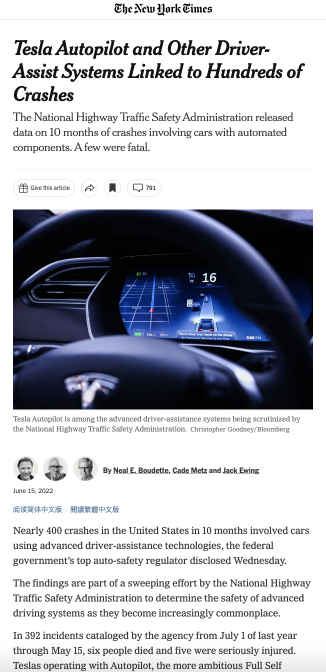
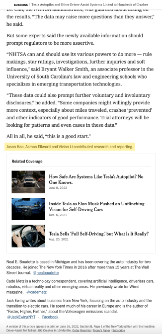
Final published article based on my data analysis with Asmaa Elkeurti and Jason Kao.
I loved responding to the journalists’ needs in real time — as they proposed hypotheses in Slack, I provided quantitative verification from the data. The process was far more fast-paced than I’d anticipated.
Maker Week 2022: Design systems library
Maker Week is a week-long internal hackathon at the Times. I worked on a tool to consolidate NYT’s many design systems: the Design Systems Library. The Times has at least 12 distinct design systems, each with their own components — but communication between them is weak, and teams constantly do duplicate work. We envisioned a library where developers could browse components from any system for interchangeable use.
I led the design research and prototyping, spending several days on competitive analysis: Material UI docs, Google Fonts and Icons, Storybook, and more. Based on those findings, we designed an interface to browse components via tags, filters, and design system pages.
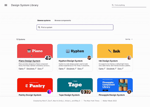
Design systems library.
Our project won Most Likely to be Used by Everyone.

Maker Week Design Systems Library team.